With Manatal Advanced Reports, you can harness your data to enhance decision-making and improve hiring performance. We’ll guide you in creating essential reports that focus on key industry metrics, helping you extract the most value from your data.
1. How to Create “Time to” Reports
In the recruiting industry, time is crucial. Understanding the time it takes to fill a position, from job creation to hiring, or identifying which stage of your pipeline takes the longest, can significantly impact your efficiency. With Manatal, you can create reports to monitor these key metrics on a daily or weekly basis.
How to Build the “Average Time to Fill per Organization” Report
This report assesses the average time required to fill a job position for each client or organization.
Step 1: Create Your Custom Metric
1. Go to Advanced Reports and create a new report.
2. Select the Matches dataset, which includes data from both the candidates and jobs datasets.
3. Navigate to the Advanced Options and add custom metrics (since this isn’t a standard metric).
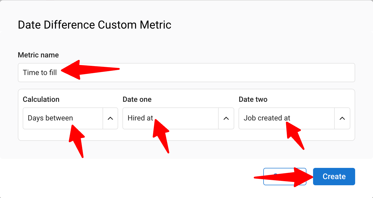
4. Choose Date Difference type to create a time-focused metric comparing two dates.
5. Name your metric “Time to Fill.”
6. Set the unit to Days (recommended).
7. Define the final date to compare as “Date One” (use the field “Hired at” for when a candidate was hired) and the initial date as “Date Two” (use “Job Created at” for the job creation date).
8. Click "Create" to save your custom metric.
Step 2: Choose Your Chart Type
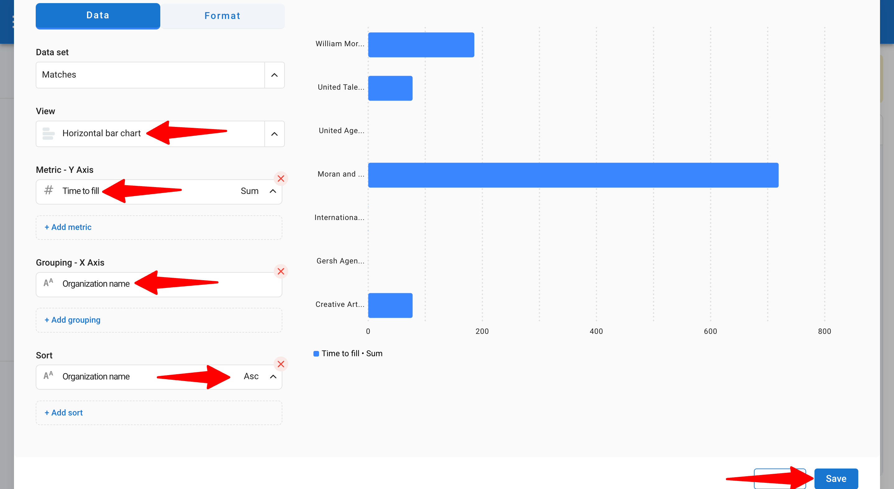
2.1 Horizontal Bar Chart: Ideal for comparing Time to Fill per organization.
1. Select your custom metric for the Y-axis.
- Mean = Average Time to Fill per Organization (most relevant)
- Max = Maximum Time to Fill
- Min = Minimum Time to Fill
2. Select the Grouping metric for the X-axis (Organization name).
3. Define Sorting preferences.
4. Click "Save".
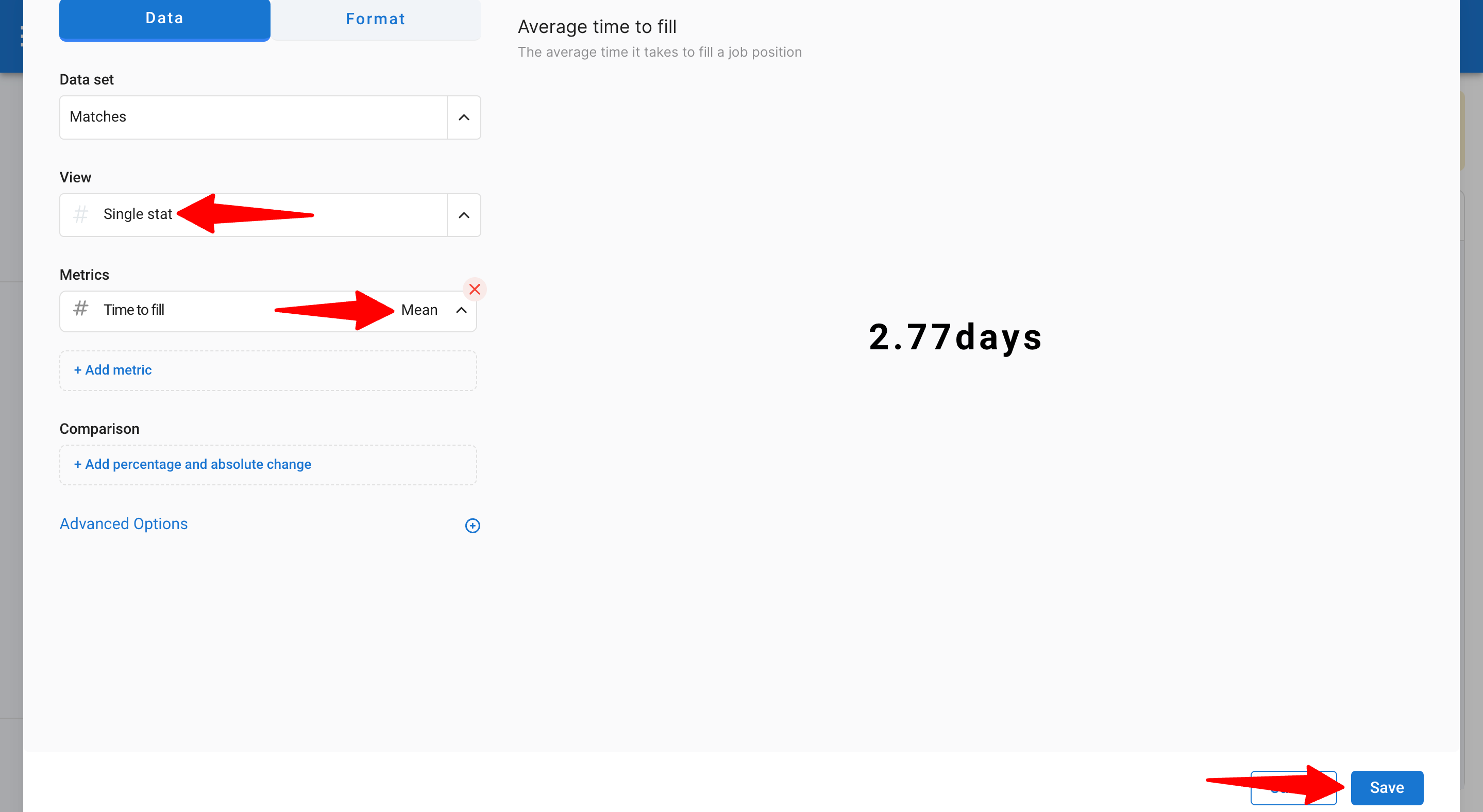
2.2 Single Stat Chart: Displays this metric as an overall KPI in your report.
1. Select the “Time to Fill” metric.
2.Adjust the unit to mean for the average.
3. Click "Save".
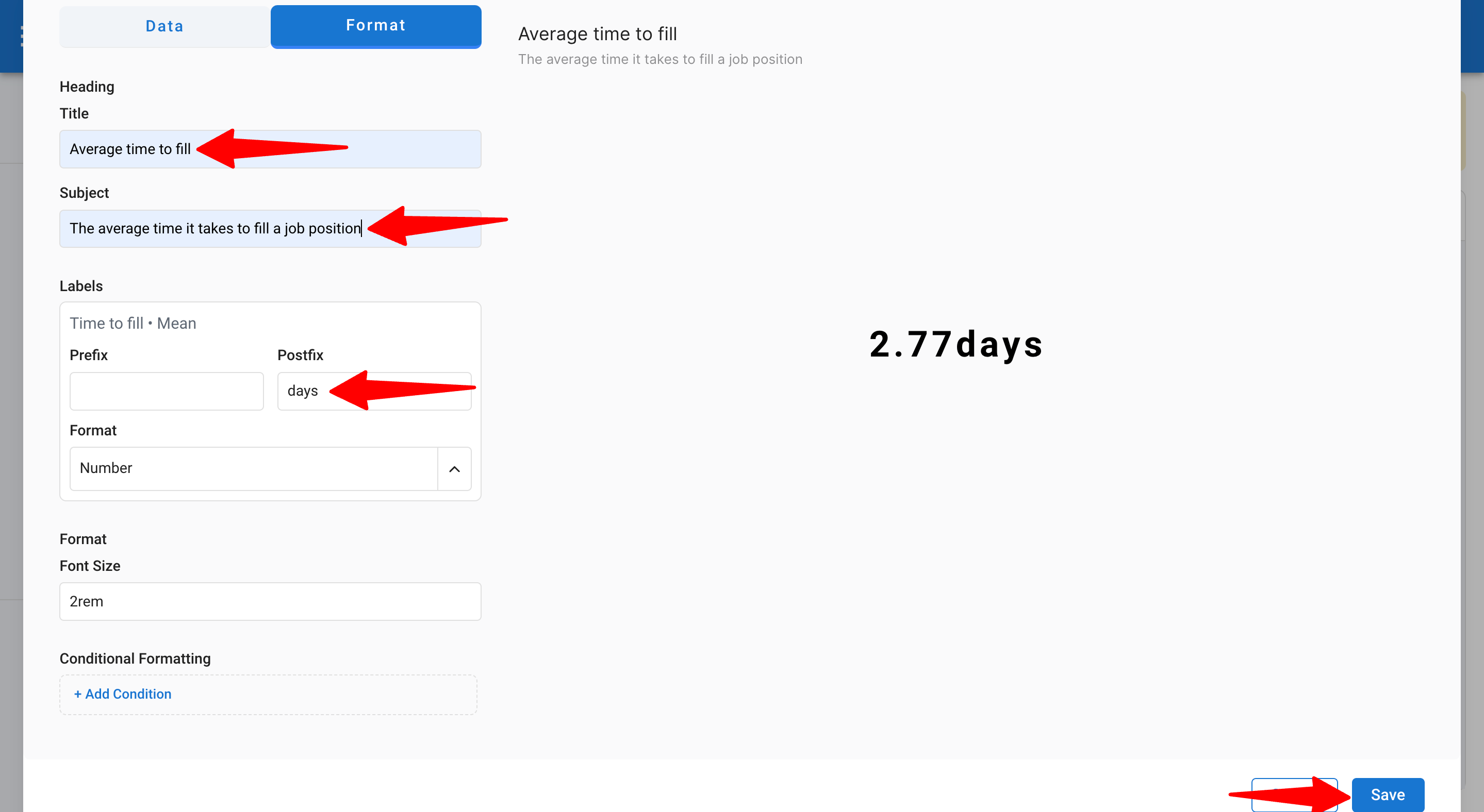
Step 3: Format Your Report
1. Go to the Format section.
2. Add a title and postfix (e.g., “days”).
3. Optionally, add conditional formatting to highlight the maximum or minimum values.
4. Click "Save".
How to Build the “Average Time to Submit Candidates per Job” Report
This report helps assess the average time it takes to submit candidates to clients for each job in your organization.
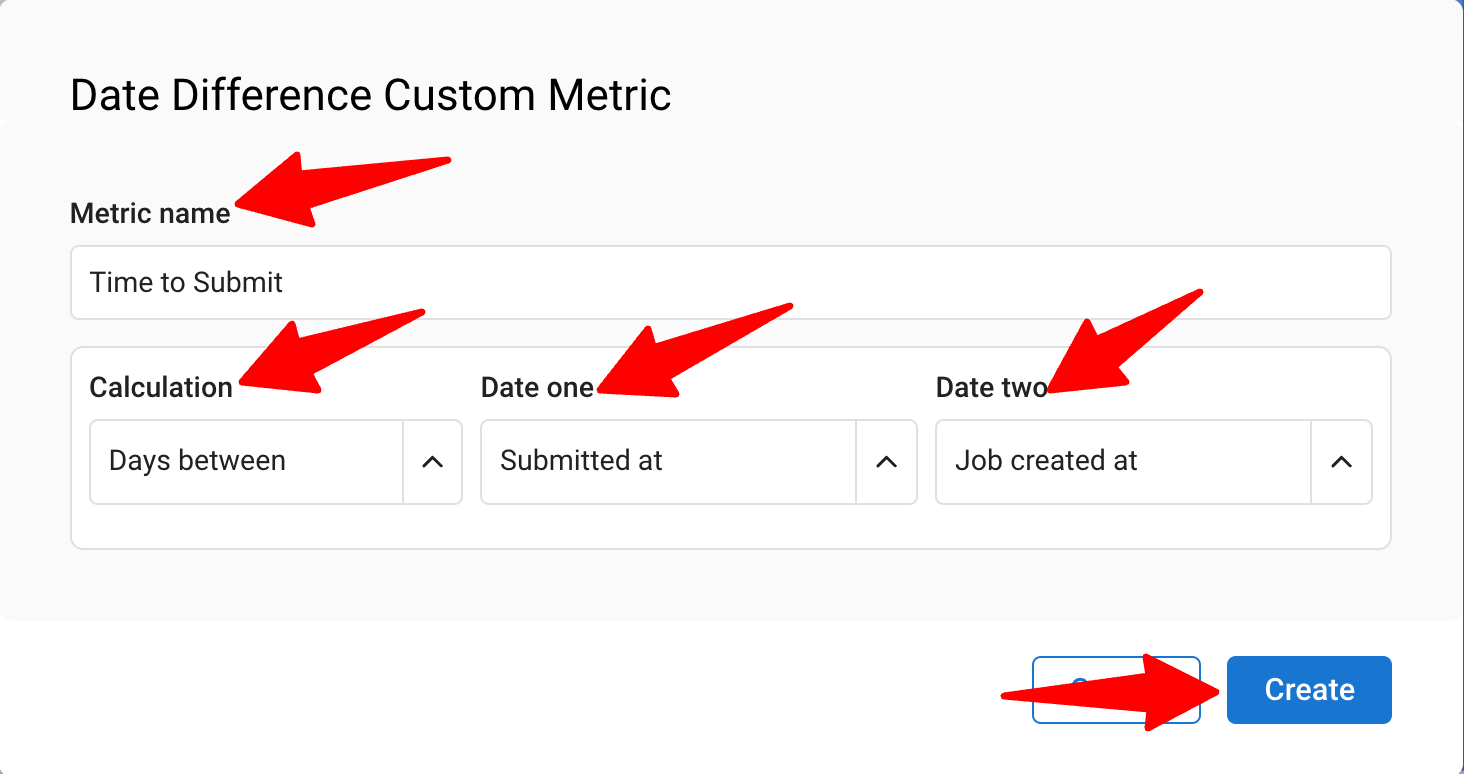
Step 1: Create Your Custom Metric
1. Go to Advanced Reports and create a new report.
2. Select the Matches dataset, which includes data from both the candidates and jobs datasets.
3. Go to Advanced Options and add custom metrics (since this isn’t a standard metric).
4. Choose the Date Difference type to create a time-based metric comparing two dates.
5. Name your metric “Time to Submit.”
6. Choose the appropriate units (e.g., days).
7. For “Date One,” select the field “Submitted at” (the date a candidate was submitted to the client). For “Date Two,” select “Job Created at” (the job creation date in Manatal).
8. Click "Create" to save the custom metric.
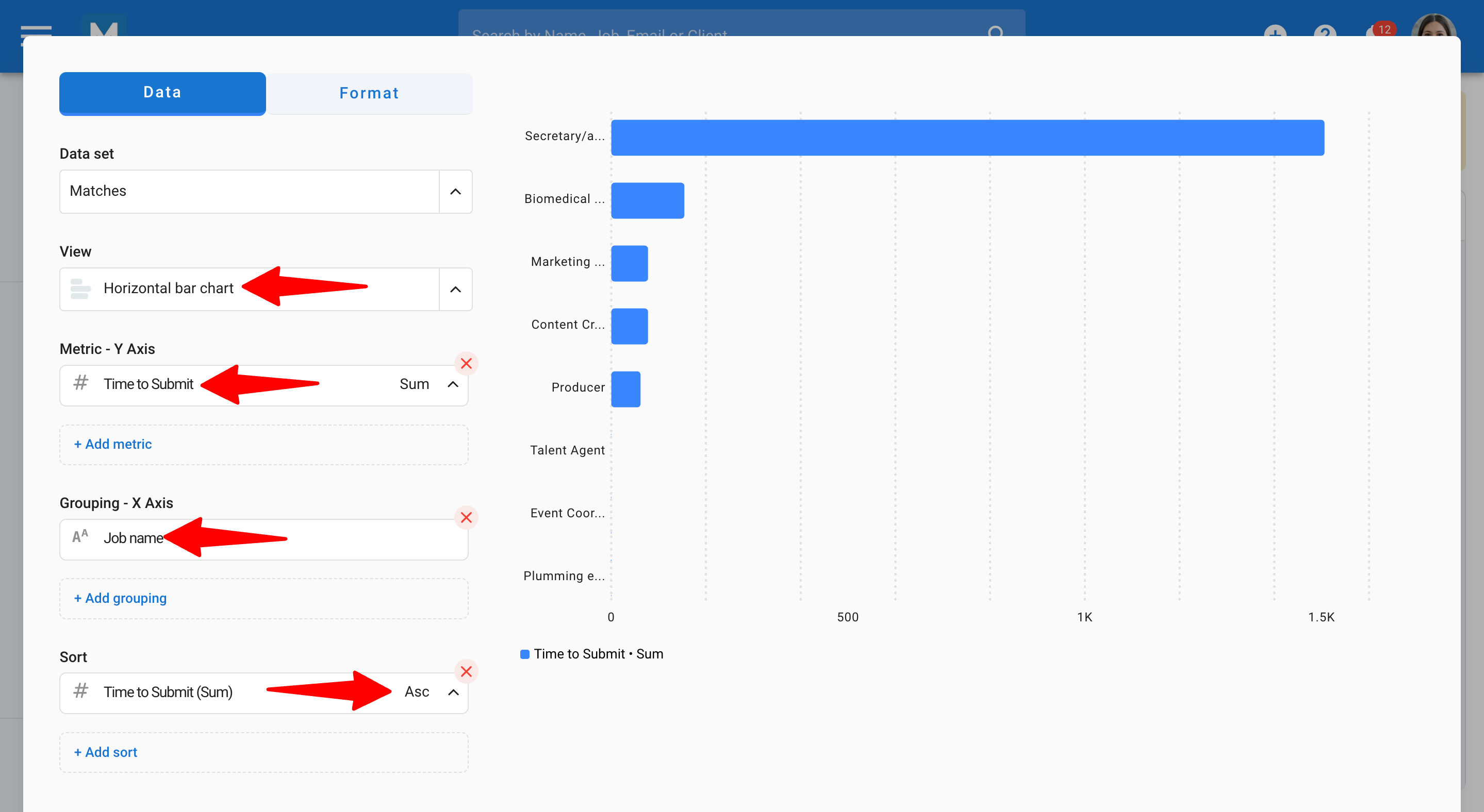
Step 2: Choose Your Chart Type
For comparing the Average Time to Submit Candidates per Job, use a Horizontal Bar Chart:
1. Select your newly created metric for the Y-axis.
Mean = Average Time to Submit Candidates (recommended).
Max = Maximum Time.
Min = Minimum Time.
2. Select Job Name as the Grouping metric for the X-axis.
3. Sort the “Time to Submit” metric in ascending order to display jobs with the highest values at the top and the lowest at the bottom.
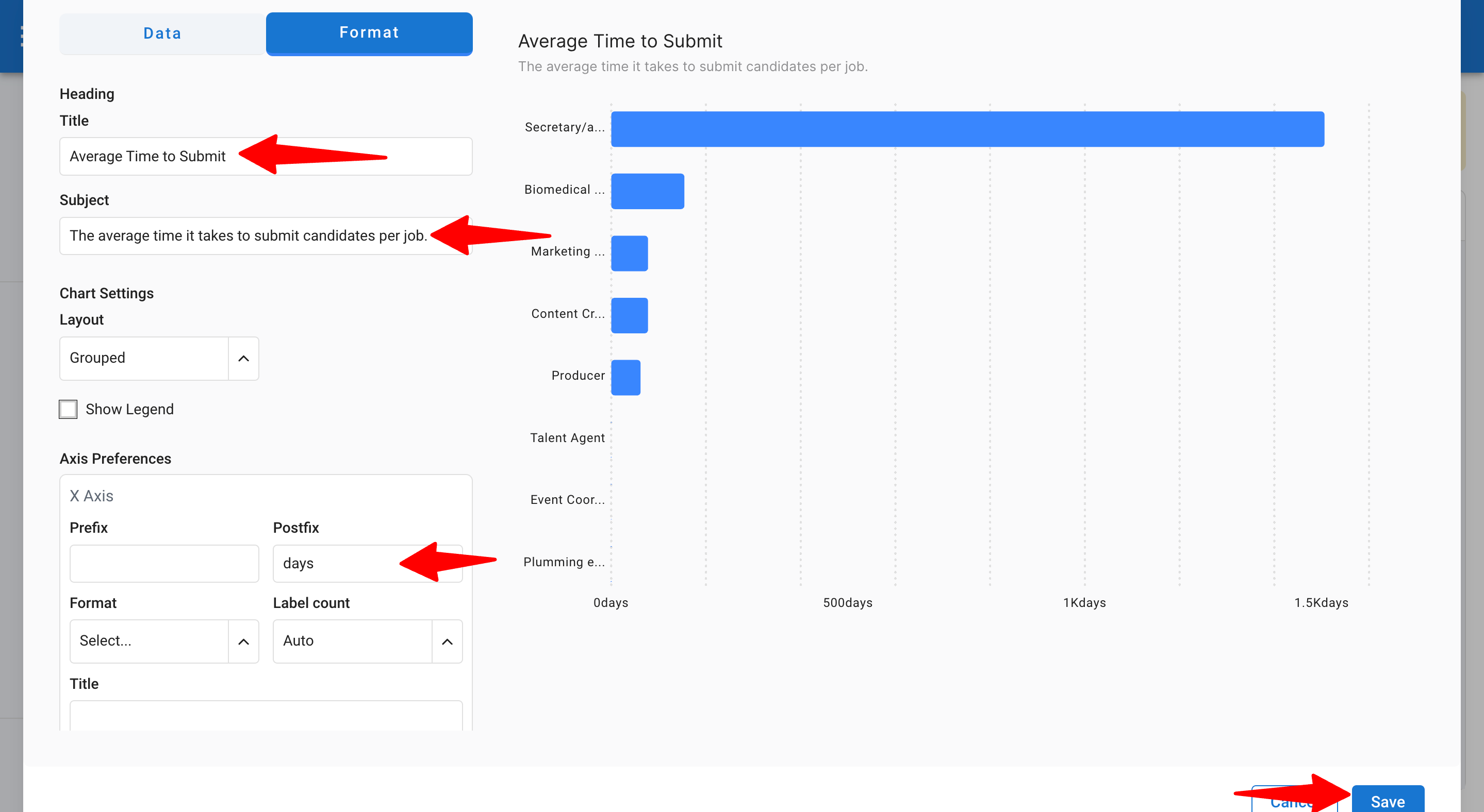
Step 3: Format Your Report
1. Go to the Format section.
2. Add a title or subject.
3. Add a prefix or postfix (e.g., “days”).
4. Optionally, apply conditional formatting to highlight the maximum or minimum values.
5. Click "Save".
How to Build the “Average Time in Stage” Report
This report helps you understand the average time candidates spend in each stage of your job pipeline.
Step 1: Create Your Custom Metric
1. Go to Advanced Reports and create a new report.
2. Select the Match History dataset (this tracks how long candidates stay in each stage of the job pipeline).
3. Go to Advanced Options and add custom metrics (since this isn’t a standard metric).
4. Choose Date Difference to track the time between two events.
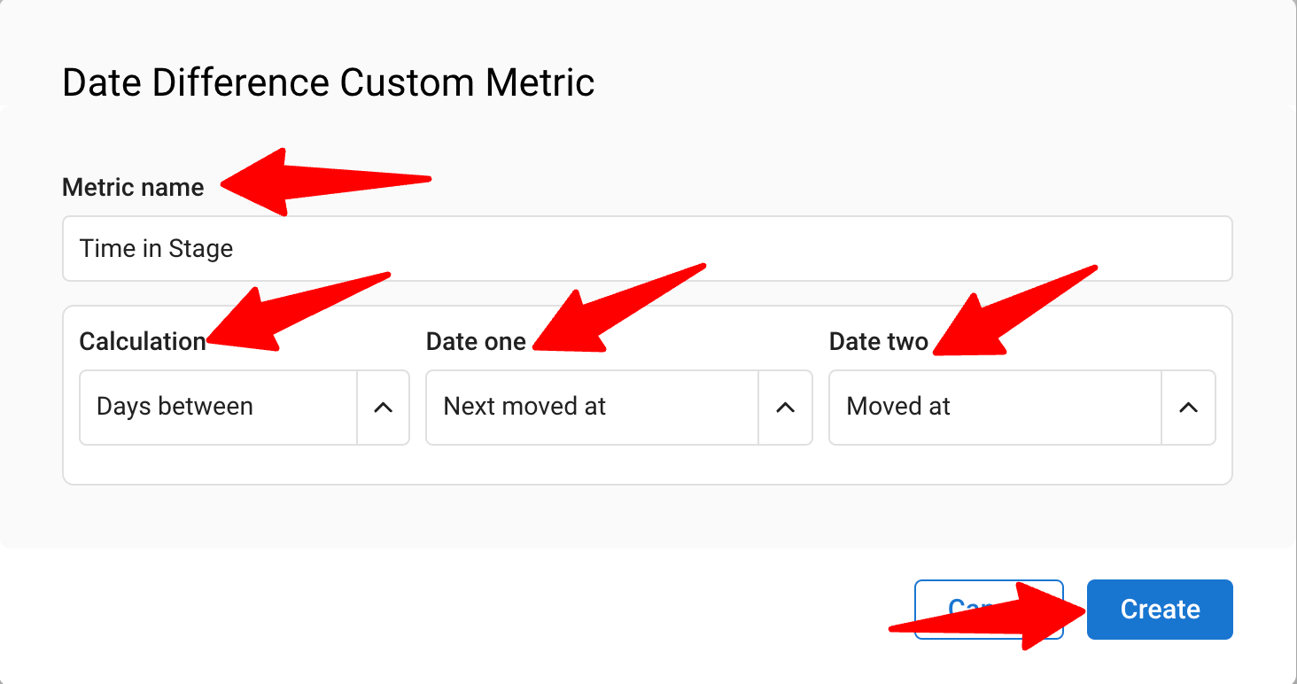
5. Name your metric “Time in Stage.”
6. Choose the appropriate units (e.g., days).
7. For “Date One,” select “Next Moved At” (when the candidate moved to the next stage), and for “Date Two,” select “Moved At” (when the candidate entered the current stage).
8. Click "Create" to save the custom metric.
Step 2: Choose Your Chart Type
To analyze Average Time in Stage, start with a pivot table and then convert to a horizontal chart.
To create a horizontal chart, you need to first build a pivot table with the desired fields and then convert it to a horizontal chart.
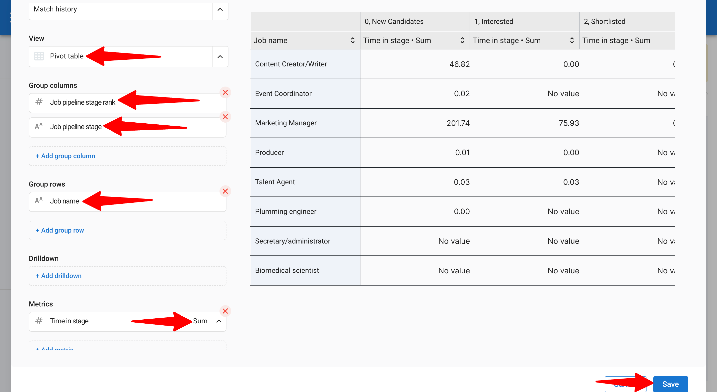
2.1 Pivot Table
1. Select Pivot Table.
2. For Group columns, choose Job Pipeline Stage Rank and Job Pipeline Stage (in that order).
3. For Group rows, choose Job Name.
4. Select the “Time in Stage” metric and choose Mean for average.
5. Sort by Job Pipeline Stage Rank (ascending).
6. Click "Save".
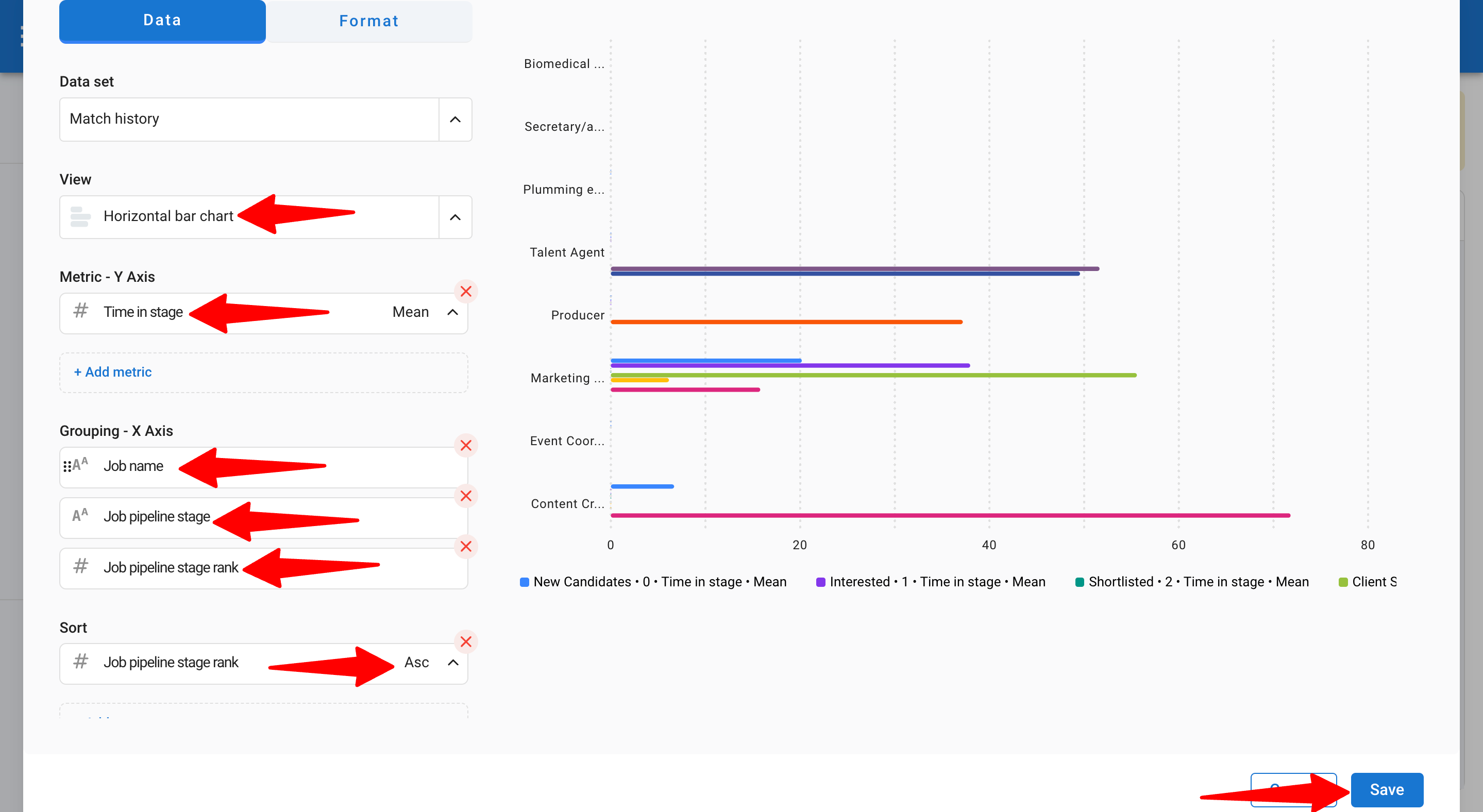
2.2 Convert to Horizontal Chart
1. Edit the table view by selecting Horizontal Chart View.
2. Ensure the Y-axis metric is “Time in Stage (Mean).”
3. For Grouping on the X-axis, choose Job Name, Job Pipeline Stage, and Job Pipeline Stage Rank (in that order).
4. Verify sorting is by Job Pipeline Stage Rank (ascending).
5. Click "Save".
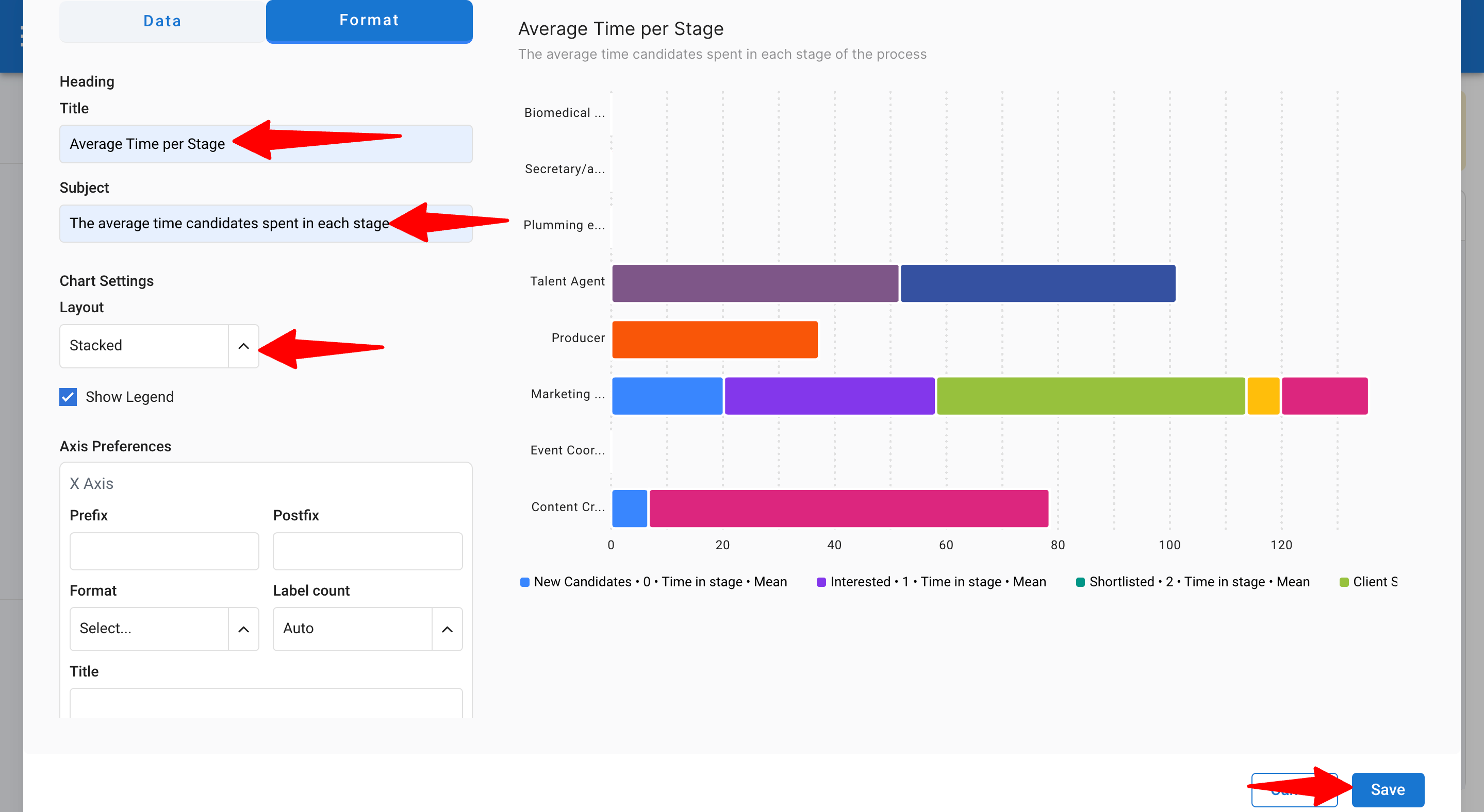
Step 3: Format Your Report
1. Go to the Format section.
2. Add a title/subject.
3. Change the layout to "Stacked".
4. Add a prefix/postfix (optional).
5. Use conditional formatting to highlight maximum or minimum values.
6. Click "Save".
2. How to Create Goals-Oriented Reports
To measure your hiring performance against specific objectives, you can create goals-oriented reports. These reports allow you to track progress toward your company’s goals, such as candidate sourcing, job creation, or revenue generation over a set target.
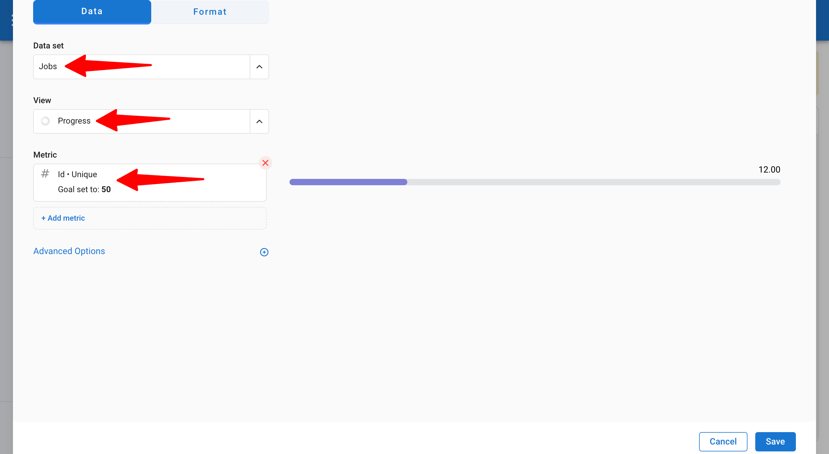
Step 1: Choose a Progress Chart
1. Go to Advanced Reports and create a new report.
2. Select the Jobs dataset (this dataset tracks job data).
3. Choose the Progress chart type.
4. Select your metrics (for example, to track the number of jobs, use "ID” as the metric and set it to "Unique").
5. Set a goal. In this example, the objective is 50 jobs.
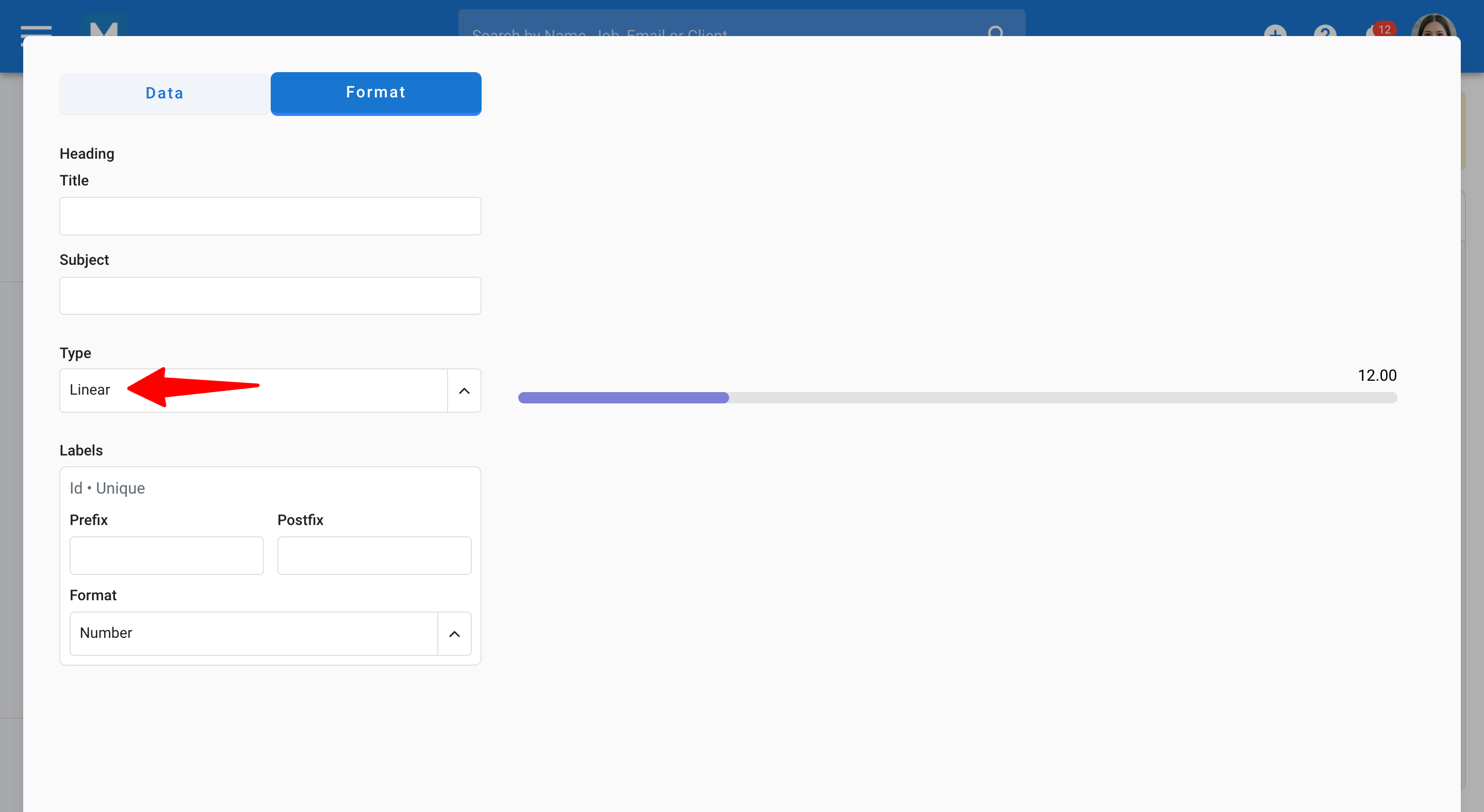
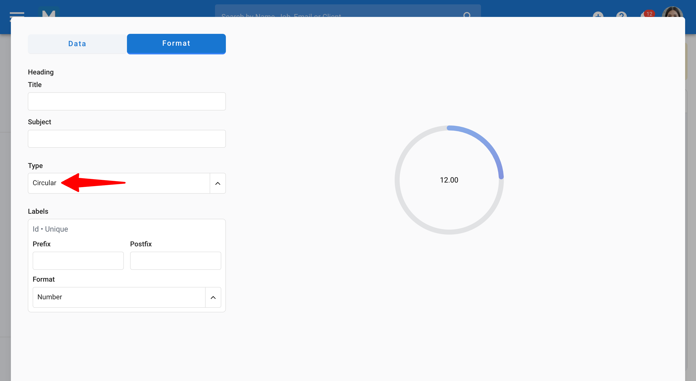
Step 2: Change the Chart Type
1. Go to the Format section.
2.1 Adjust Type to a Linear Chart
2.2 Adjust Type to a Circular Chart
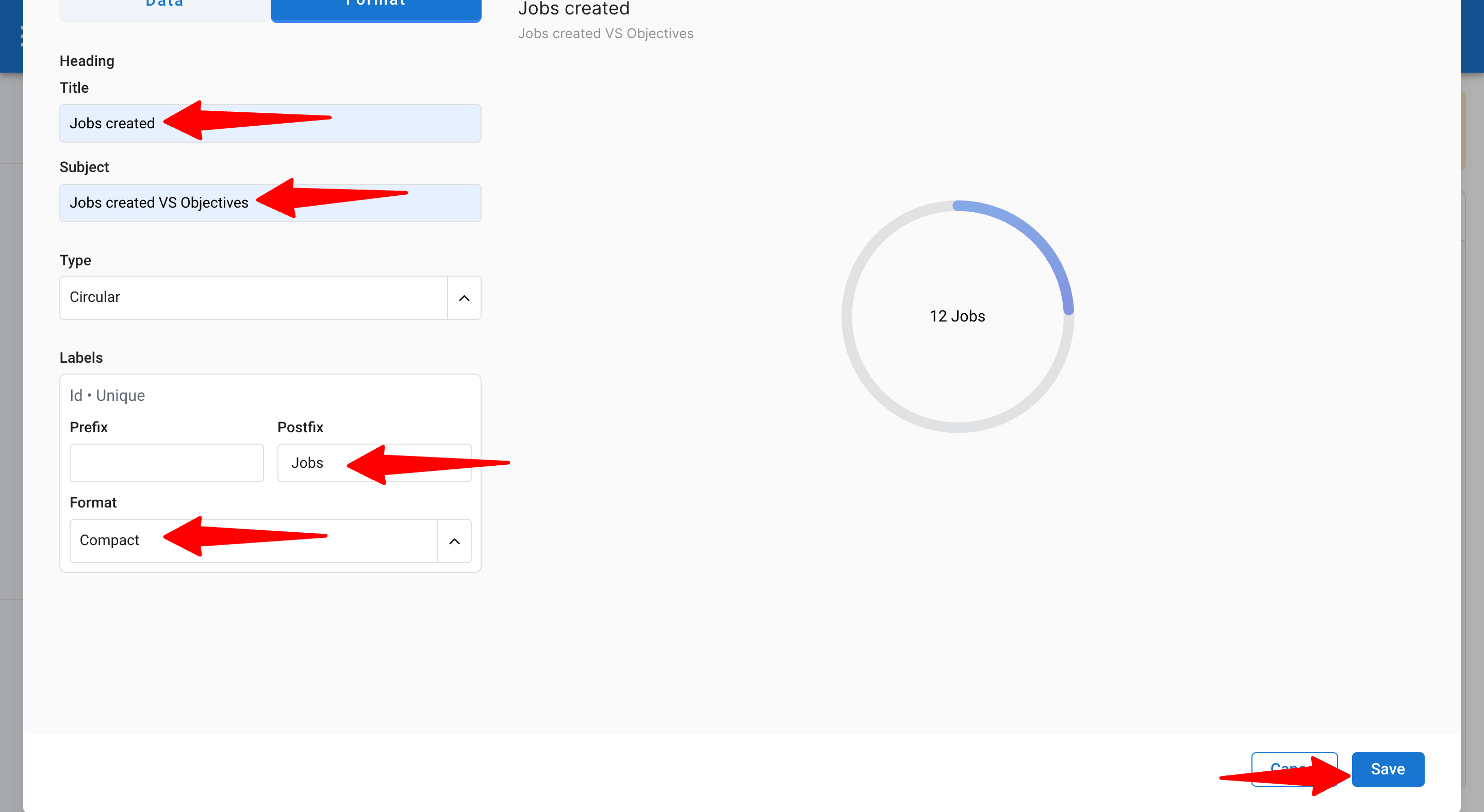
Step 3: Format Your Report
1. Add a title or subject.
2. Add a postfix (e.g., “Jobs”).
3. Adjust the format to Compact.
4. Click "Save"
3. How to Track Your Revenue
You can easily track the revenue generated through successful placements and compare it to your internal targets by defining custom goals. These reports help you monitor business performance and ensures clear visibility into how well you’re meeting your revenue targets over time.
Key Reports You Can Create with Manatal
- Total Revenue Generated: Provides a top-level view for managers to monitor financial health.
- Revenue Generated vs Target: Assesses performance progress over a specific period and acts as a motivational tool for teams with clear insights on objectives.
- Revenue Generated Over Time: Offers a visual assessment of performance trends, helping to anticipate slow or busy recruiting periods.
- Revenue by Clients: Identifies which clients generate the most revenue, helping prioritize high-value clients and increase satisfaction.
- Total Revenue by Clients: Displays a cumulative view of client contributions, helping identify upsell opportunities and improve customer support.
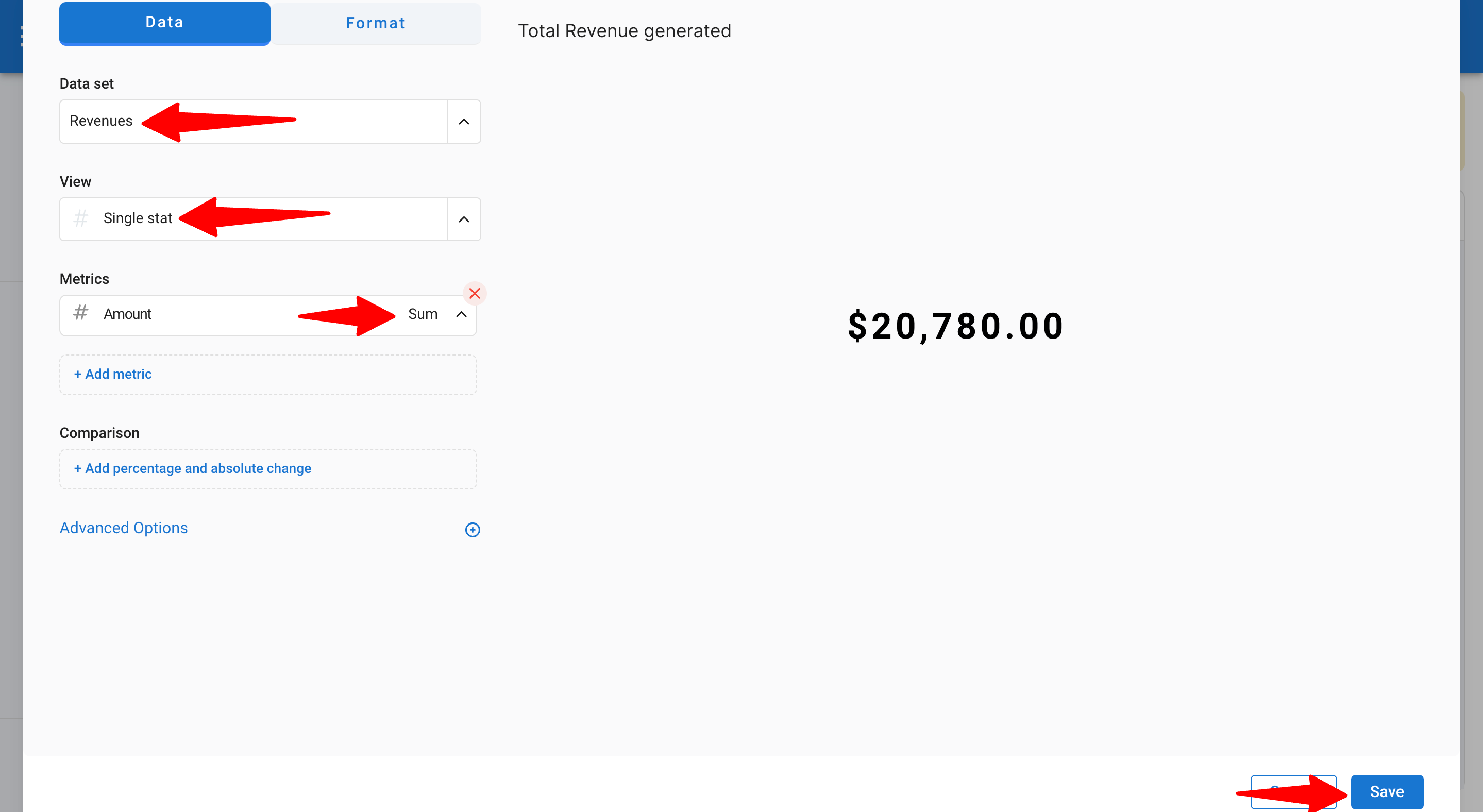
How to Track Your Total Revenue Generated with a Single KPI
1. Go to Advanced Reports and create a new report.
2. Select the Revenues dataset (records all revenue data from job placements).
3. Choose Single Stats chart type.
4. Select the metric → Amount in Sum (to display the total revenue generated from job placements).
5. Go to the Format section to adjust the title, subject, and currency.
6. Click "Save"
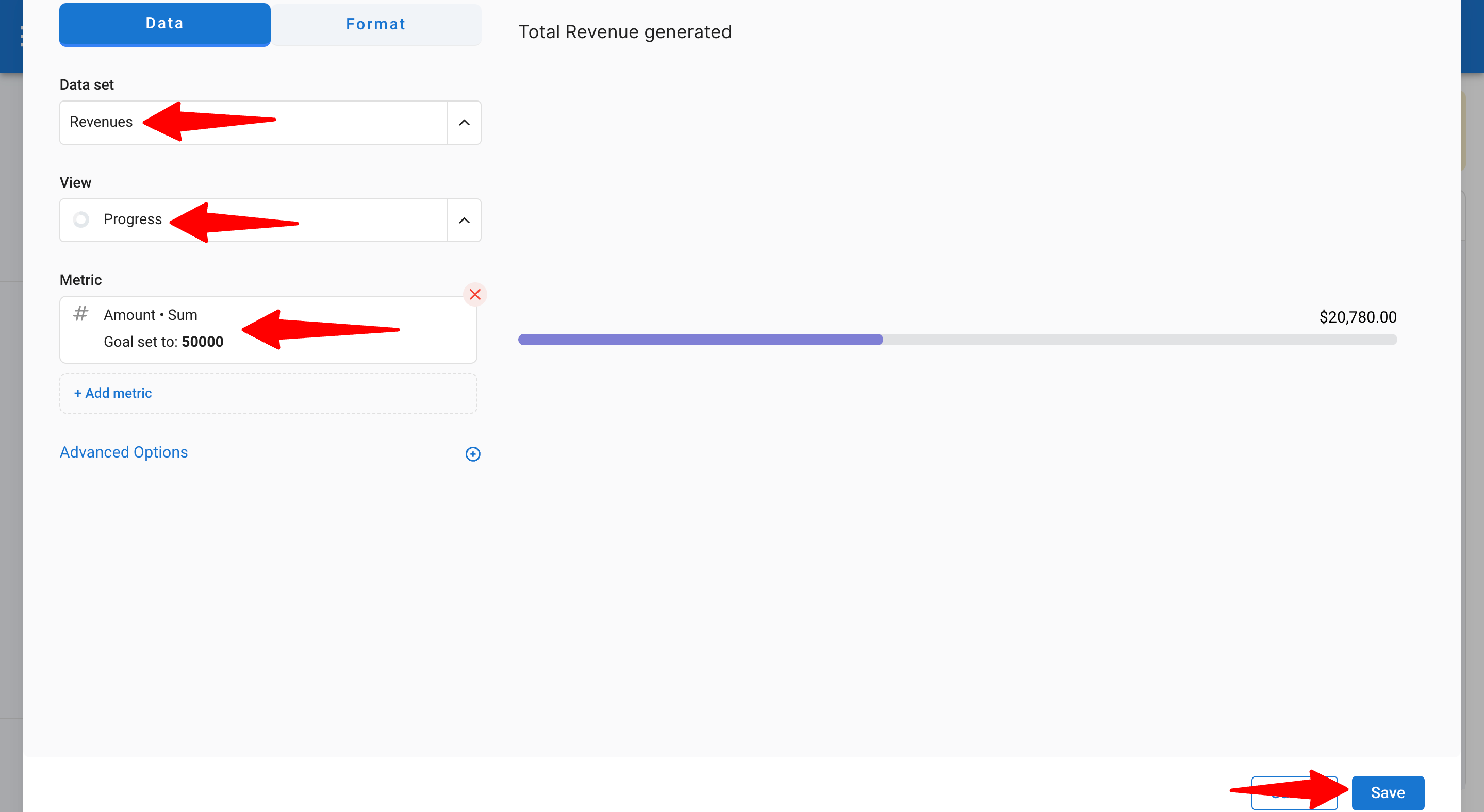
How to Track Your Revenue Generated Versus Your Target Objective
To track revenue generated against a specific target:
1. Select the Progress chart.
2. Add the metric → Amount in Sum (to display the total revenue generated from job placements).
3. Define your goal.
4. Go to the Format section to adjust the title, subject, and currency.
5. Adjust the type of progress chart (circular or linear).
6. Click "Save".
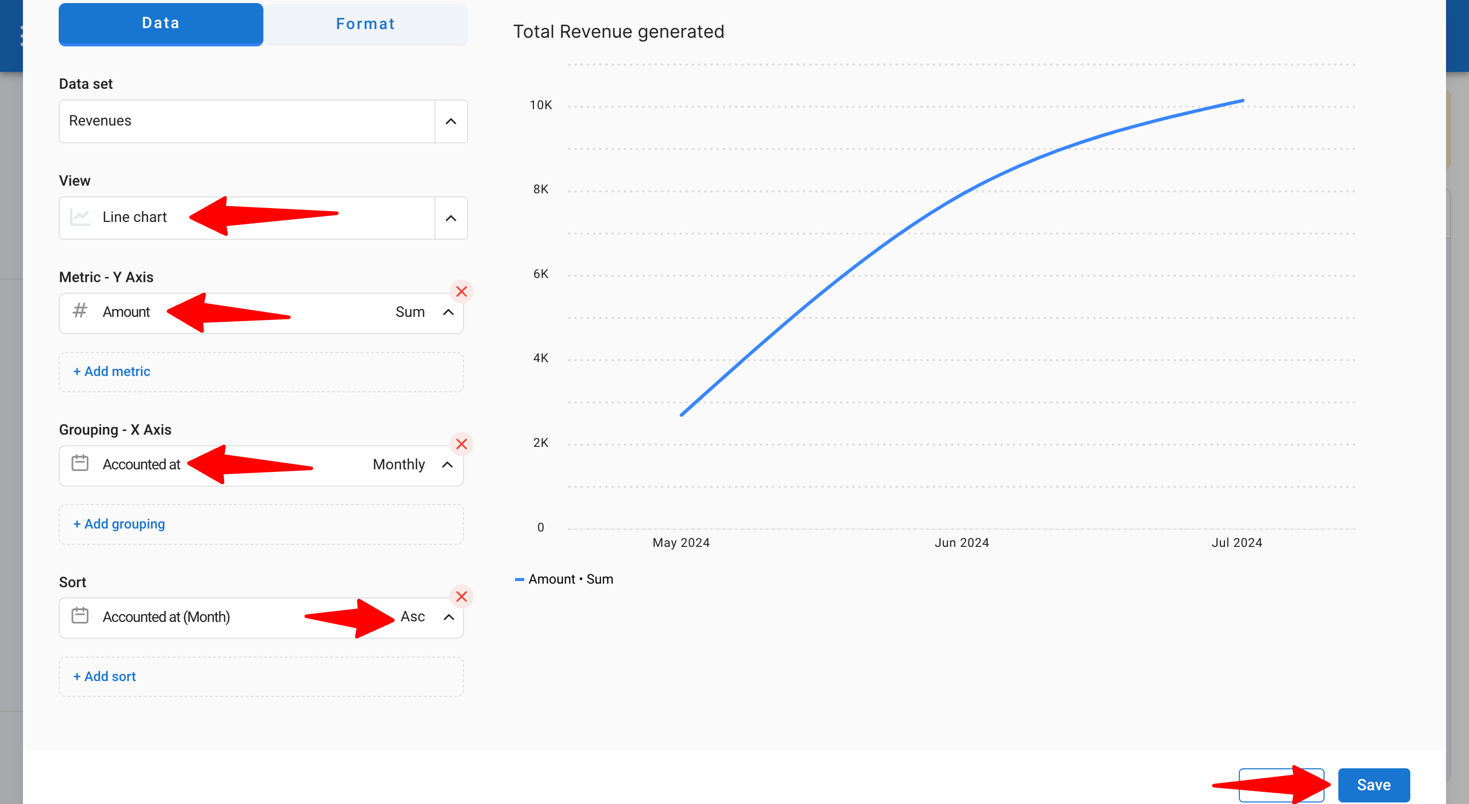
How to Track Revenue Growth Over Time
To track how your revenue evolves over the month:
1. Select the Line chart.
2. Add the metric → Amount in Sum (to display the total revenue generated from job placements).
3. Group X by Accounted At on a Monthly basis (to track revenue evolution from the Accounted date).
4. Sort by Accounted At Ascendant.
5. Click "Save".
4. How to Track Sales Activities
With Manatal, you can easily track all activities created in your accounts (tasks, calls, meetings, emails). This ensures that every interaction with a candidate is documented, providing a complete history for future reference.
How to Track the Number of Activities per Month
1. Go to Advanced Reports and create a new report.
2. Select the Activities dataset (records all activities information).
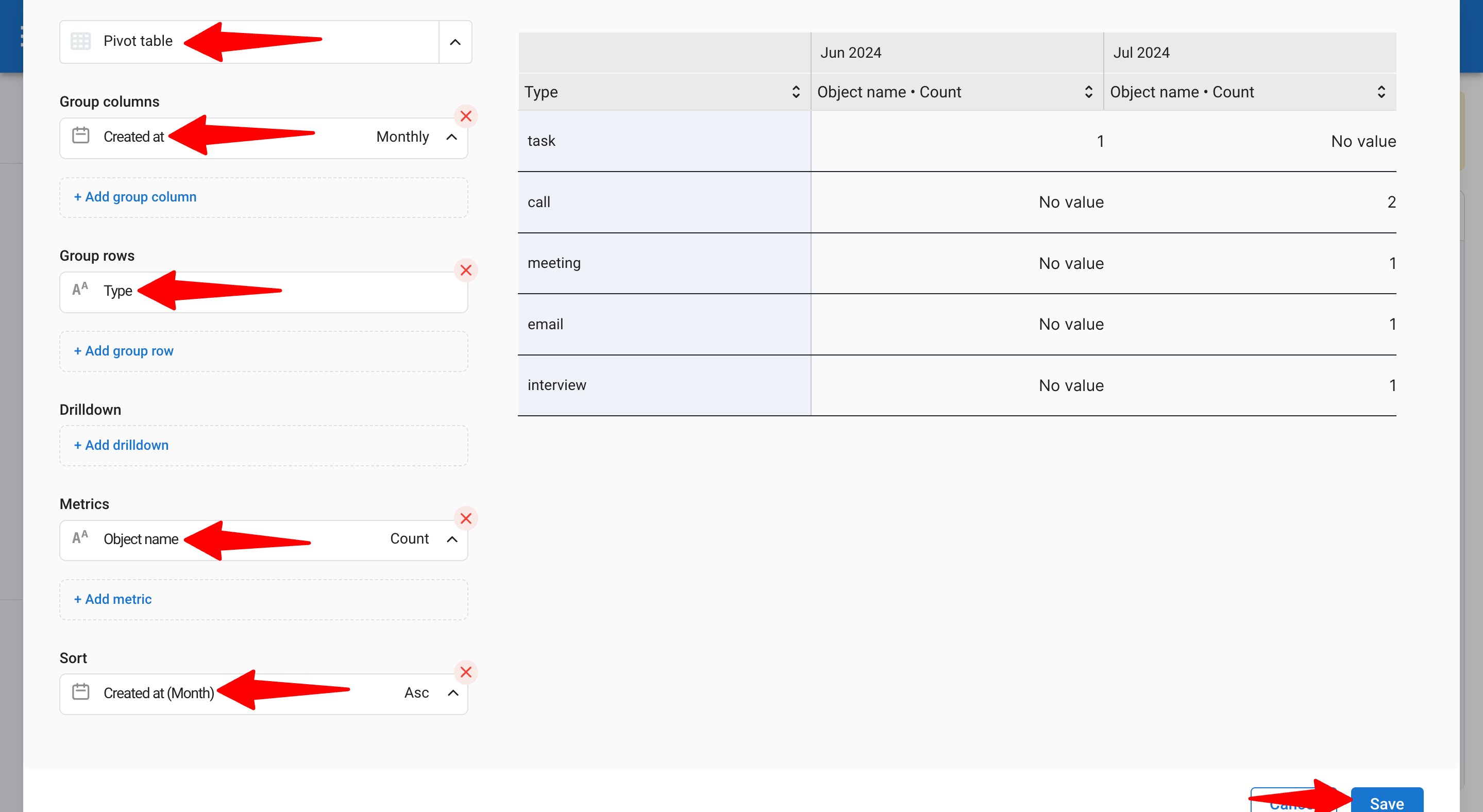
3. Choose the Pivot Table chart type (best for analyzing multiple data types).
4. Group columns by Created At on a Monthly basis.
5. In the Group Rows, select Type (refers to the type of activities).
6. In Metrics, choose Object Name (to calculate the total count of activities).
7. Select Count.
8. Sort by Created At (to display monthly tracking).
9. Go to the Format section.
10. Fill in the title/subject.
11. Click "Save".